Clinspire
Human-Centered AI for Oncology Trial Enrollment
Project Brief
Connecting Cancer Patients to the Right Clinical Trials
Clinspire is an AI-powered platform developed in collaboration with oncologists from Mayo Clinic to improve the clinical trial enrollment experience for oncology patients. The project aimed to address key barriers such as complex eligibility criteria, fragmented data systems, and low patient accessibility to trial information.
The objective was to design a human-centered digital solution that simplifies trial discovery and eligibility screening while supporting clinician workflows. The team explored conversational AI, plain-language summaries, and visual eligibility tools to create a transparent and accessible trial matching experience for both patients and healthcare providers.
Timeline
14 weeks, Spring 2024
Role
Product Designer
Organization
Mayo Clinic
My Role & Contribution
Making Clinical Trial Access Transparent and Human-Centered
I contributed across the end-to-end UX process for Clinspire, from research synthesis and user flow mapping to wireframing and prototyping patient and clinician experiences. I translated complex clinical trial eligibility logic into clear, human-centered interactions, designing features such as AI-guided onboarding, plain-language trial summaries, and visual eligibility tracking while iterating based on clinician feedback and usability testing.
PROBLEM CONTEXT
Life Saving Trials Are Out of Patients' Reach
Oncology clinical trials sit at the intersection of urgent need and systemic friction. It began with a simple yet profound question:
How might we make joining a clinical trial feel less like paperwork and more like support?
More than
1.7M
people are diagnosed with cancer each year in the US
Approximately
7.1%
of adult patients with cancer actually enroll in a clinical trial
It takes about
8.2
months for an oncology trial to be ready to enroll patients
Even when patients do make it into a trial, the experience is far from straightforward:

This combination frustrates patients, overloads clinicians, and slows down research that could meaningfully change outcomes. Clinspire was designed to operate precisely at this pressure point: where eligibility, comprehension, and trust regularly break down.
the Process
Designing an AI-Assisted Workflow for Trial Matching
After establishing the design system, we prioritized high-fidelity patient flows to maximize impact within our timeframe. We chose this focused approach over a multi-role design to ensure depth and quality despite limited access to clinicians and caregivers for testing.

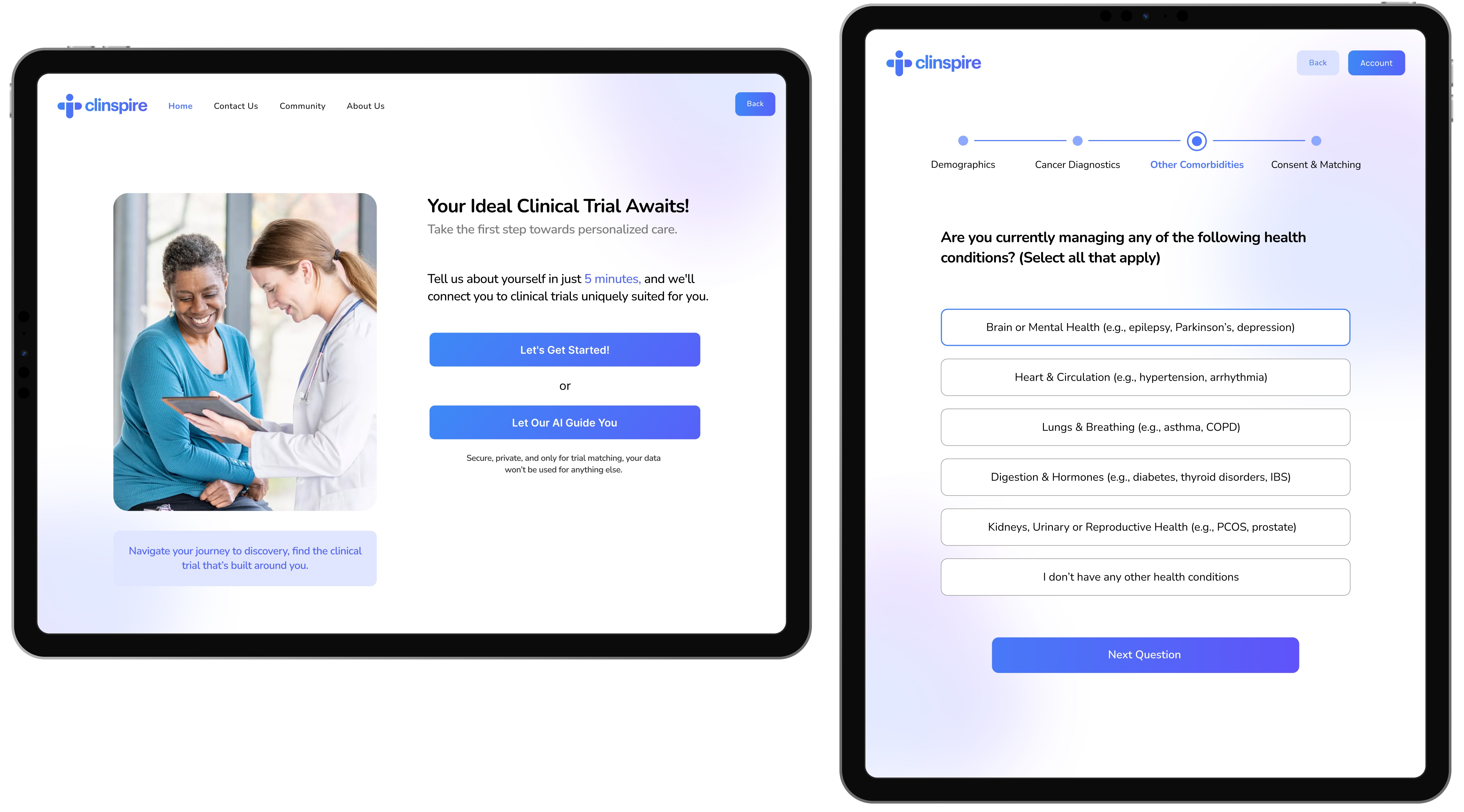
Homepage
The homepage provides immediate orientation without overwhelming the user. A central search bar and EHR connection offer two clear paths: manual search or automated matching.
Onboarding
The onboarding screen lowers tension with a calm, human-centered layout. Patients choose between a manual or AI-guided path, respecting their tech comfort while nudging toward supportive assistance. Upfront time estimates (~5 mins) and privacy reassurances further reduce anxiety regarding effort and data sharing.
Feedback
Early feedback suggested our questions felt too generic and not clinically grounded.
Design Response
We restructured onboarding around the five major body systems, making the flow meaningful for oncologists and understandable for patients. We rewrote prompts in empathetic, conversational language so patients felt supported rather than interrogated.
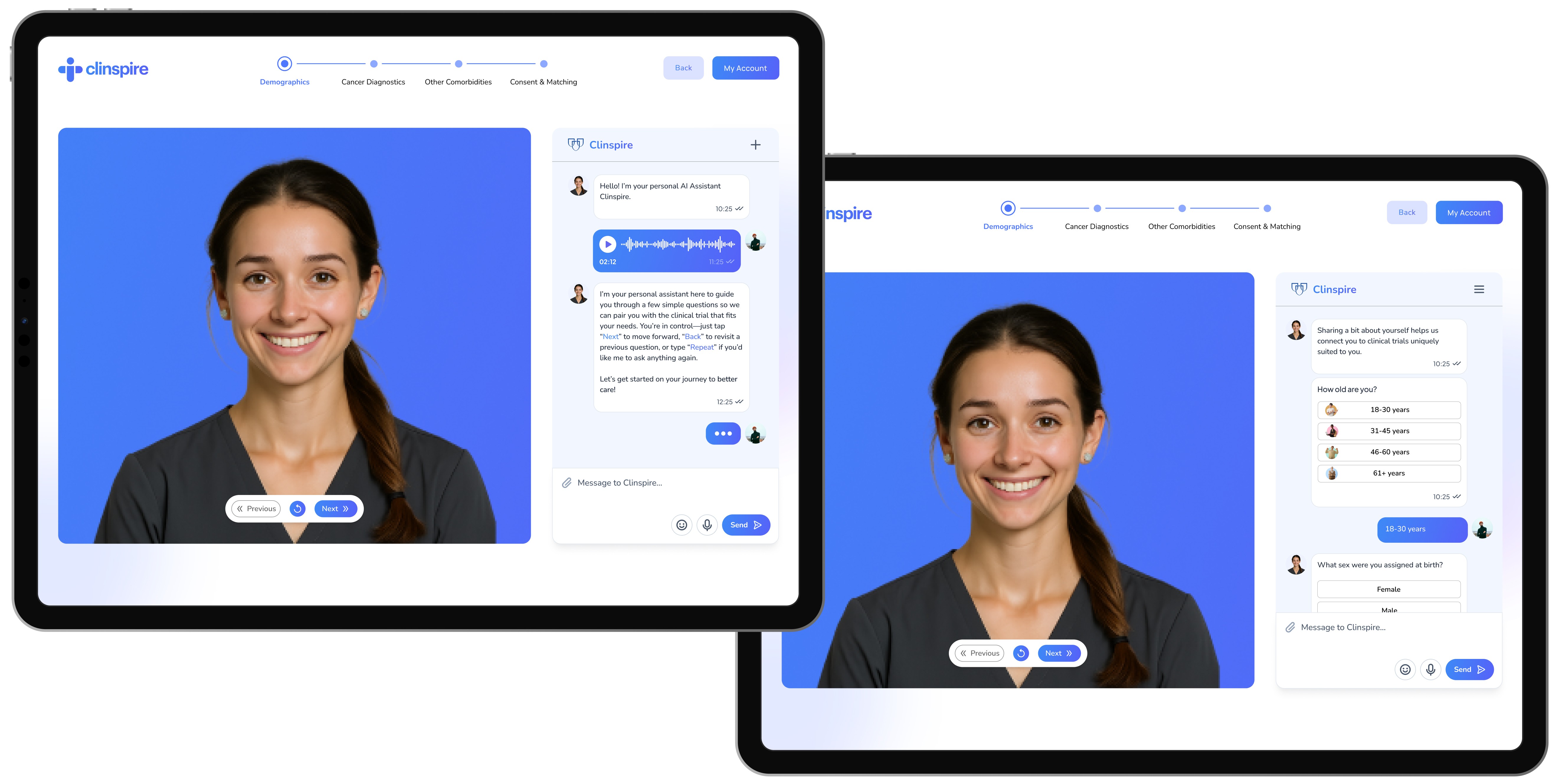
AI-Assisted Onboarding
The AI-assisted flow provides conversational guidance through four stages: Demographics, Diagnostics, Conditions, and Consent. By combining spoken and written prompts with clear navigation and empathetic instructions, the interface ensures the process feels manageable and accessible rather than clinical or intimidating.
Feedback
In early reviews, the chatbot felt functional but flat, too much like a form pretending to be a conversation.
Design Response
We introduced an animated avatar paired with left-aligned chat bubbles and a manual text input field. This gave the assistant a clearer presence on screen and made the interaction feel more like a dialogue patients could control, not just a script they had to follow.
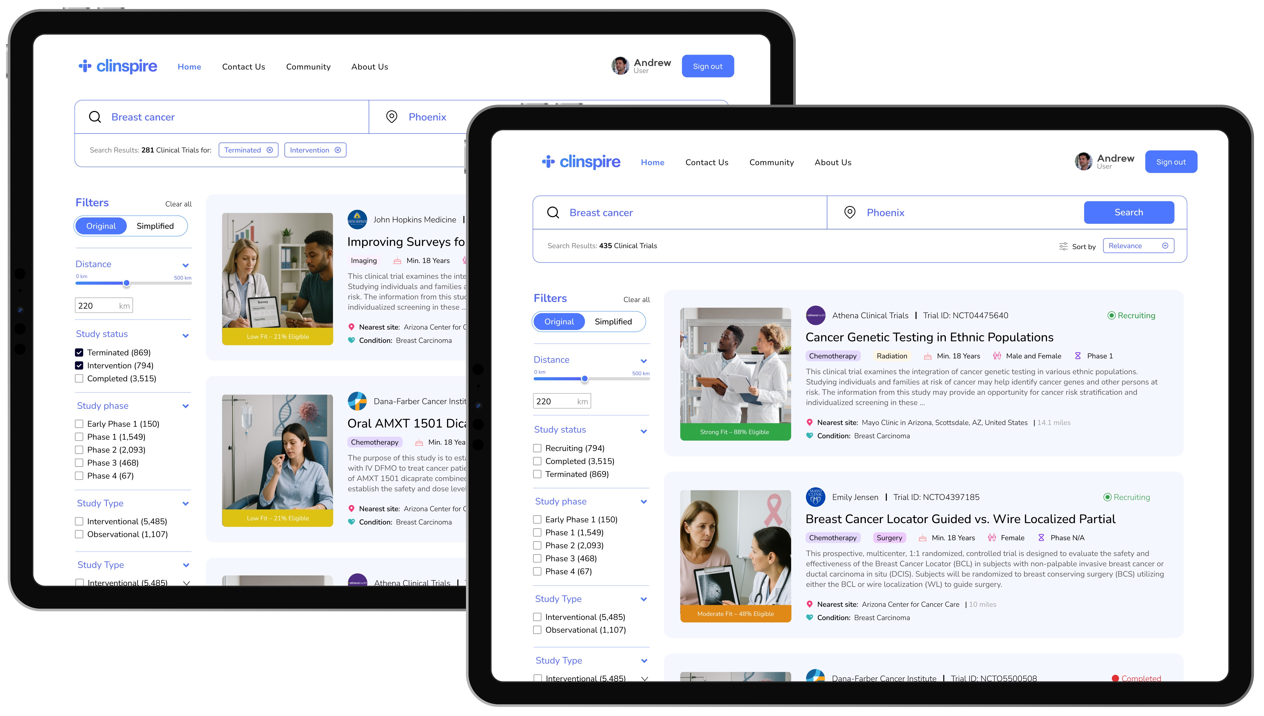
Search Results
The search results page simplifies trial discovery through intuitive inputs and filters. Trial cards highlight essential decision-making data including eligibility indicators, treatment overviews, and site details. A color-coded, card-based layout reduces cognitive load, allowing patients to scan and compare options with ease.
Feedback
Initial reviews surfaced that our filters weren’t fully leveraging the rich data collected during onboarding.
Design Response
We updated the design so that filters and ranking could reflect practical constraints, such as travel feasibility and patient profile, in addition to clinical attributes. This made the results feel less like a generic list and more like a grounded, realistic set of options for that specific patient.
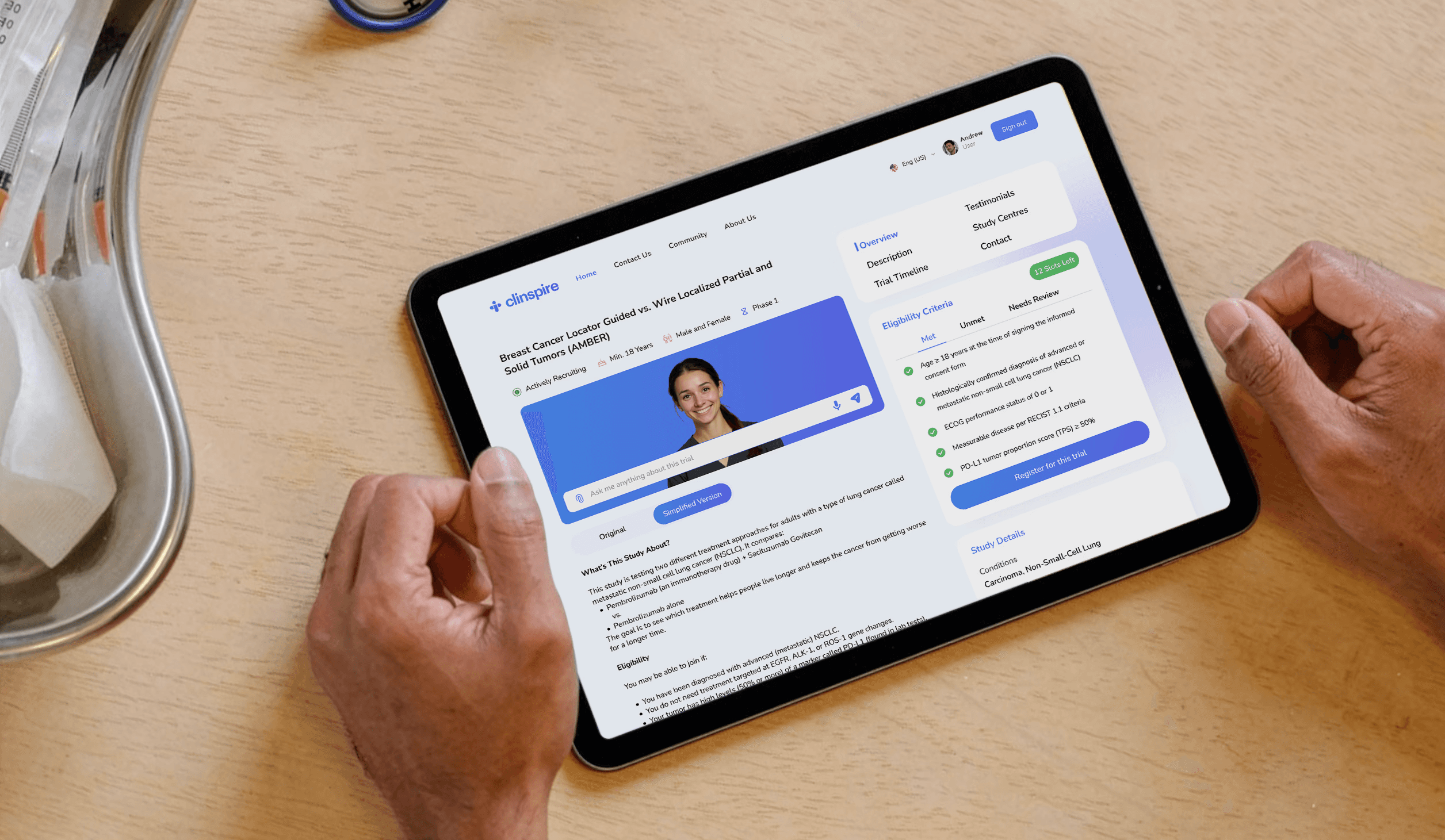
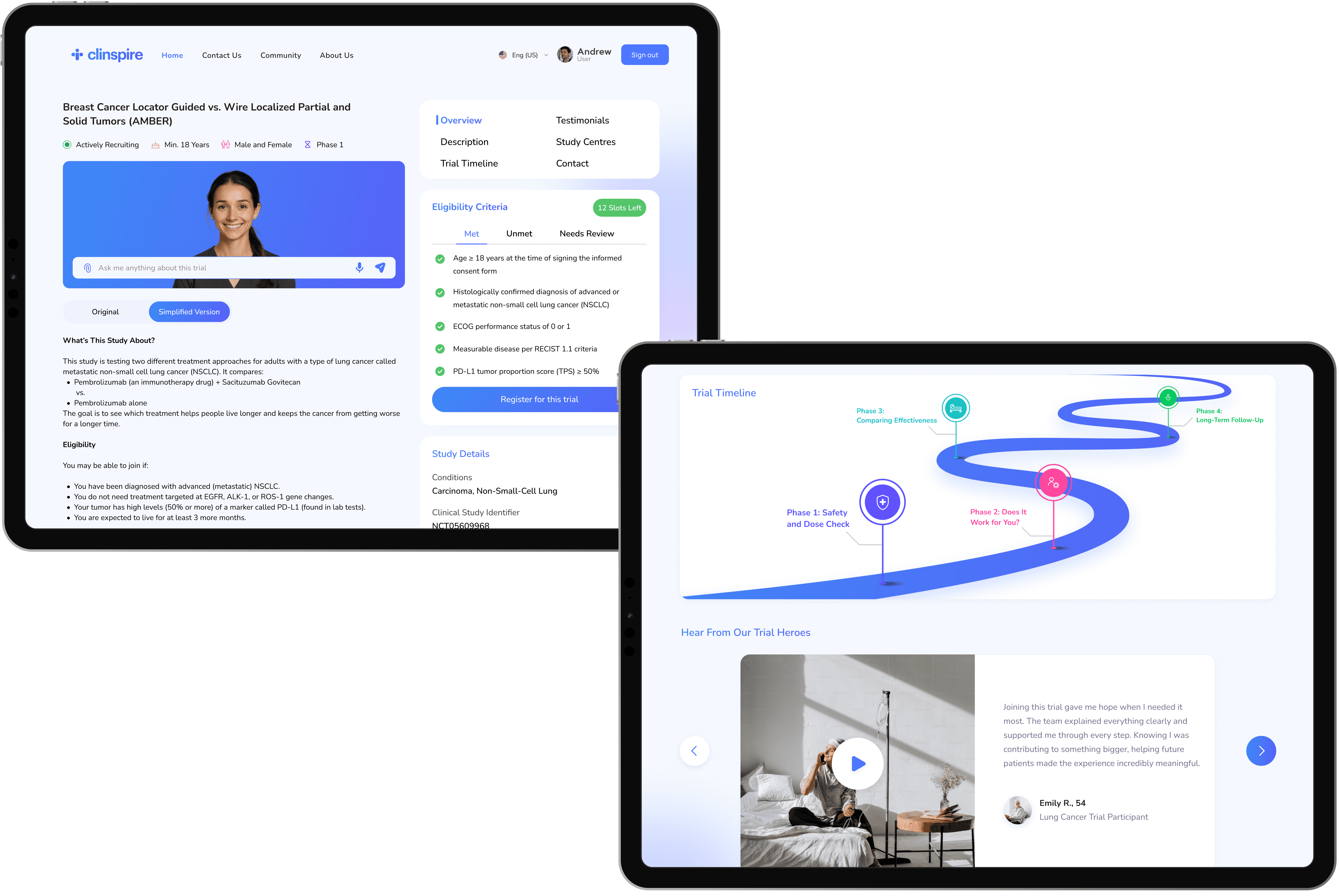
Trial Details
The trial detail page helps patients determine if the trial is right for them. Essential info is highlighted via icons, while a plain-language toggle allows users to switch between technical and simplified views.
Eligibility is transformed from dense text into a structured checklist with visual states (met, unmet, or review). A primary register button anchors the page, supported by tabs for testimonials, study centers, and timelines to keep the interface focused yet comprehensive.
Feedback
Trial pages lacked clarity
The eligibility process was confusing
Users wanted more transparent timelines
Lack of testimonials to foster trust
Design Response
We introduced a dual-tab view and color-coded filters to enhance visual hierarchy
A new structured section categorizes criteria as met, unmet or needs review
We redesigned the trial timeline using a clickable progress bar with milestones for better visibility
We explored ways to include real patient testimonials to foster a stronger emotional connection with users
user and stakeholder feedback
Validating The Vision With Reality Checks From Experts
Throughout the project, we regularly presented our flows and prototypes to Mayo Clinic oncologists, our course faculty, and a collaborating developer to stress-test the concept for clinical realism, feasibility, and clarity.
"From a clinical workflow perspective, this is very close to something we could pilot. The journeys and language are almost market-ready."
Dr. Umar Januja
Oncologist, Mayo Clinic
"The flows are technically realistic. It’s clear where data comes from, how AI is used, and how this could plug into real systems without overwhelming them."
Owen Witte
Developer, Mayo Clinic
"Strong synthesis of research and interaction design. The team clearly understood the problem space and translated it into a coherent, clinically relevant experience."
Dr. Shah Noor Shafqat
Faculty
key learnings
Things You Only Learn Working With Oncologists
Throughout the project, we regularly presented our flows and prototypes to Mayo Clinic oncologists, our course faculty, and a collaborating developer to stress-test the concept for clinical realism, feasibility, and clarity.
AI only works if the experience explains itself.
Every AI touchpoint had to answer three questions: What is it doing? What is it using? What can I change? That drove choices like explicit eligibility markers, dual clinical and plain-language views, and visible data sources, so patients and clinicians could trust the system without needing to trust the magic.
Healthcare UX is system design in disguise.
The friction lived in EHR silos, staffing constraints, and manual workflows. The clinicians wanted fewer eligibility spreadsheets, fewer back-and-forths, and clearer patient status. That shifted our mindset from designing one single product to designing a node inside a larger clinical ecosystem.

future steps
What It Would Take To Go Live
Separate patient and provider experiences, that is, a patient-facing mobile app and a provider-facing web app.
Integrate with hospital systems using secure patterns aligned with FHIR/HL7 and major EHR vendors like Epic.
Define a robust LLM safety and governance framework, such as guardrails, logging, escalation, and disallowed behaviors.
Strengthen privacy, consent, and access control for AI features, including audit logging and community/peer-support moderation.
Expand validation with real patients, nurses, and coordinators in clinical settings, and explore integration middleware like MirthConnect for reliable EHR connectivity.